
We were recently approached by an existing Sage user, to review their system and ensure they are getting the most out of their package. One area that stood out (and a personal bugbear of mine) was relating to the layouts they were producing as part of their process. When queried they said “We use this layout for Euro, this one for Sterling and this one for Dollar as they all have different bank details” The user chooses which one they print as part of the print run.
It was at this point I explained that all Sage systems can have a currency attached to the trader record and therefore we can have just one layout that conditionally prints the correct currency symbols, correct bank info and if required, the correct language on all labels. This was implemented and immediately reduced the amount of time it took to process the documents.
The interesting point there was that the layouts were fundamentally correct, but the users were not taking advantage of some of the more advanced features.
This is a common issue that stems from changing requirements and the system having ad hoc updates to make it fit without understanding what can be achieved with the correct setup.
Another common issue is formatting. While there isn’t a common rule for this usually a rule of Text Left and Numbers Right will provide a cleanly presented layout or report.
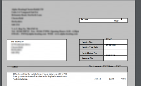
In another example, I personally purchased a new shower from a local plumber. This was accompanied by an email invoice that I instantly recognised as a Sage document.
The problems with the layout were also clear
The site was using the standard Invoice layout with its standard fonts and background. At some point, this has been amended and everything has been thrown out of alignment.
This is probably an extreme example of what some Sage users will endure as part of their Sage user experience when these are simple things to correct when you know how to use the designer tool.
The changes suggested to improve the layout include:
- Amending the template (grey background) to suit the fields required and corporate brand colours
- Addition of a logo
- Change of font to the company brand
- Correct alignment of data in the columns and their headings (text to left, numbers to right)
- Automatic attachment of T&Cs as a PDF
Once these changes were implemented, there was a huge improvement to the outgoing documentation.
Quite often we see layouts where simple alignment issues are clearly present, but no one has corrected these. This normally is where a user has a centralised or left-aligned number or where the heading is out of alignment to the value below it. By using the “align” tools in Sage Report Designer, this can easily be corrected.
Spacing is another stand out area. After years of working with Sage Reports it’s clear to see when the spacing between rows is not uniform. Sage has a “snap to grid” system that should prevent this but by manually moving fields with the mouse or having different height variables, this can cause spacing issues when laying the data out on the page. In addition, many sites we come across have not taken advantage of the progression of the Report Designer tool and its new functionality.
The latest versions of Sage have new features that were not available 3 or 4 versions ago, yet users still use the old layouts. Improvements in the Email functionality, drill down and templates can make big differences to users if they are used properly. These can be introduced to existing layouts without the need to redesign them.
Finally, there is also the ability to extend the report data in Sage 200. The Sage 200 database is SQL, and as such, data can be transformed (summarised, filtered, excluded) prior to it appearing on a report. This means that complex (or sometimes impossible) calculations can be done at the server side then presented to the report designer. We often see this where users are taking data out of Sage into Excel to perform these calculations themselves. This can be time consuming and by the time the work is complete, the Sage 200 data has moved on. As experts in Sage data, we can pre format the information to meet the users’ requirements without the need for any further manipulation.
At Smith Cooper, we offer a review service to highlight any issues you may be having with your Sage 200 reports and can provide the consultancy to correct any problems or to add any further information. We also offer a half day report designer training course that covers the 5 key areas of Sage report design.
If you are interested in this please contact Richard Brewster on 01332 959008 or email [email protected]
Interested to know more about our Sage solutions?
Call 01332 959008 or enquire online today
"*" indicates required fields